Painting is a serious love of mine. I can't wait to plein air paint this summer.
Some mostly done portraits I did for Nancy before spring break. I am varnishing them and rendering a bit farther on some things for them so it's not so flat in places. As you can see, I like redheads. They're a rare breed.


Here's some shots of things I'm currently working on- I had issues updating recently due my camera and losing things from spring break.

In progress portrait for Nancy's class, 2nd to last one is almost done!
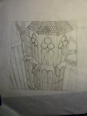
Creative perspective assignment that I'm really ambitious about it but frankly I need to do this if I want to get better at environments. This old grid is getting redrawn for corrections.
The inking I did for my Tarot card in Imagemaking; I'm coloring digitally, so I'll post updates of this by Saturday.

Large piece for Nancy, it's a based off an ink sketch I had based on a daydream. Headless people.
This oil painting needs tweaking, but it's for Tech 2... the longer I look at it, the less effective I think it is conceptually speaking; composition-wise it makes sense. Trial and error.

some color studies of a personal piece for a possible book cover thing in Tech 2.
Things I learned this week getting back to CCS...
Being the student rep for my department is really an experience; relationships in the Illustration Family need strength and support in leadership. It's just hard to get together when CCS swamps you with work and other commitments.
Artists are really islands and we need to get to know each other more often. As a freshman, I met numerous people that I consider great friends. Even now, I find new people that are considerate. It's those people that pull you out of a crappy day.


